The Data Grid widget displays the output of a grid report (i.e., IGridReport) in a sortable, filterable grid that supports paging. EQuIS Information Agents (EIAs) for grid reports can also be used as a data source for the widget. Since the visibility and order of report fields can be configured, this widget is useful for reviewing data without downloading the full report output. When properly configured, values in the data grid can be edited and used to send OData requests, which allows users to update existing values or create new entries in the grid that are saved to the database (see OData in Data Grid Widget article).
The Data Grid widget can be configured to act as a dashboard filter, using the underlying report's parameters as the filters and the data as the filter values. The Data Grid widget also supports filtering using Filter widgets (if not set as a dashboard filter).
Note: The Data Grid widget will run the underlying report with each action (sort, filter, switch pages, change page size, etc.). EarthSoft highly recommends using report caching (see User Profile) when using the Data Grid report. Report caching will significantly reduce database load and improve the end user experience while using the widget. |
Data Within the Grid
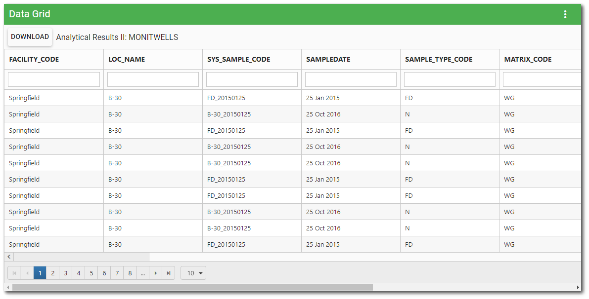
When using the Chrome browser, individual cell selection in the data grid is functional. The data columns of the Data Grid widget can be sorted or filtered.
Sorting – The columns are sortable in ascending or descending order by clicking on the column header (click again to reverse the sort). The sort is applied to full report output (with filter, if applicable); it does not just apply to the currently visible page of the grid.
Filtering – Beneath each column header is a filter box that filters on that column only. Enter a search term (one or more characters) in the appropriate search box beneath the column header. Only records that contain the search term will be displayed. Filtering is cumulative if multiple columns are filtered.
Download – Click the Download button to download all pages of the grid data as a Microsoft Excel file (*.xlsx). The downloaded file will respect any active filter and/or sort currently applied to the grid.
The bottom of the widget contains paging controls for displaying a limited number of items at a time, as described below.
Arrows – Use the left/right arrows to navigate through pages.
Go to Page List – Select a specific page to navigate directly to that page.
Rows per Page – Change the number of items to be displayed per page by using the drop-down menu.
Count of Pages and Total Items – This control indicates the total number of items available in the widget, how many pages to display the items, and which page is currently selected.
Dashboard Filtering
The Data Grid widget can be configured to act as a dashboard filter, using the underlying report's parameters as the filters and the data as the filter values. Use the Widget Editor to configure a Data Grid widget to act as a dashboard filter. Any visible field(s) can be set as the dashboard filter by navigating to the field row, then selecting the appropriate value from the drop-down in the Filter Name cell.
The columns (fields) that are configured to be used as filters will display the  icon next to the column name in the grid header. When filtering is enabled, the report name will no longer display on the widget.
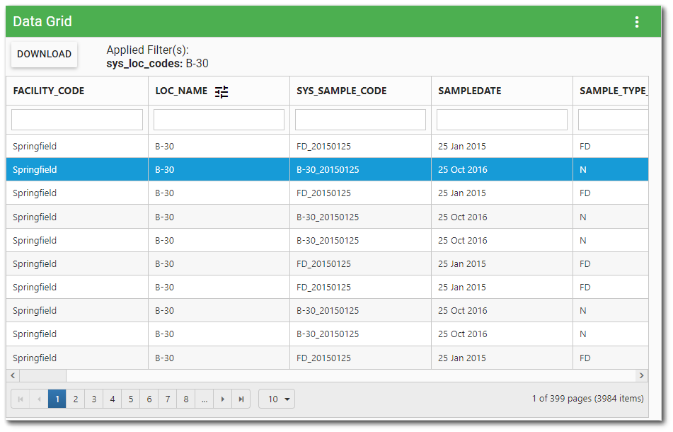
When the Data Grid widget is configured to be used as a dashboard filter, selecting a data row in the grid will result in the filter column(s) being used as filter value(s) for the selected filter, and other widgets on the dashboard will filter their data in response to the filter value(s). The selected filter(s) and value(s) are displayed above the data grid. In the image above, B-30 is the filter value for LOC_NAME (i.e., SYS_LOC_CODE) and all other widgets on the dashboard affected by the filtering will only display content associated with Location B-30.
Note: Refreshing the Data Grid widget will clear selected filtering values. The active filter (i.e., selected row) will also be removed if the user sorts or filters the data columns of the Data Grid widget or changes the pagination. |
Once the Data Grid widget is configured to work as a dashboard filter, it will no longer respond to other filters on the dashboard. The Data Grid widget will also override any other filters (e.g., Filter-List widgets) set to the same parameter on the dashboard (i.e., the filtering functionality is not additive). For example, if the FACILITY_ID and SYS_LOC_CODE columns are configured to be used as a filter, the session facility and any SYS_LOC_CODE filter on the dashboard will be overridden when a data row is selected.
Multiple Selections Option
The Data Grid widget can be configured (in the Widget Editor) to allow selecting multiple rows, which will filter on multiple values simultaneously. Users can select multiple filter rows by holding down CTRL+ or SHIFT on the keyboard and clicking a new row. Once row(s) are selected, the "Apply Filter" button will be enabled. Click the Apply Filter button to have other widgets on the dashboard filter their data in response to the filter value(s). The selected filter(s) and value(s) are displayed above the data grid. Click the Clear button to clear the filters.
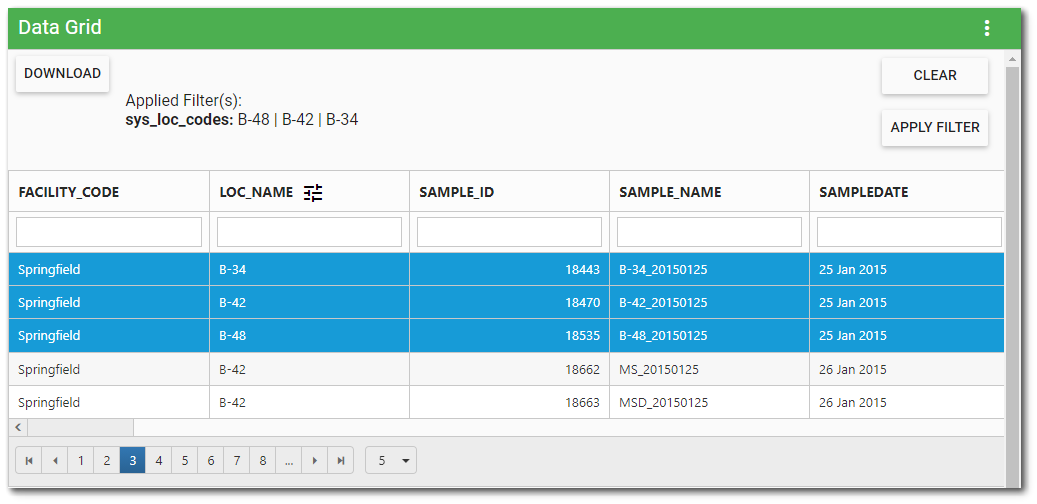
In the image above, the filter values for LOC_NAME (i.e., SYS_LOC_CODE) are B-34, B-42, and B-48. All other widgets on the dashboard affected by the filtering will only display content associated with these three locations.
Note: If Multiple Selections is enabled and OData requests are configured, only the first row selected will be editable. |
Widget Properties
The Data Grid widget is empty when added to a dashboard and must be configured to show report results. The editor for this widget allows the user to select a report, and then use the columns from the report to configure the widget appearance. The columns that are displayed and their order are controlled by the widget properties.
To add a report or edit other widget properties, open the Widget Editor by selecting the More Options  icon in the upper right corner of the widget to display the drop-down menu and then select the Edit menu option. The Widget Editor includes two tabs used to define what and how the widget contents are displayed: Report and Advanced.
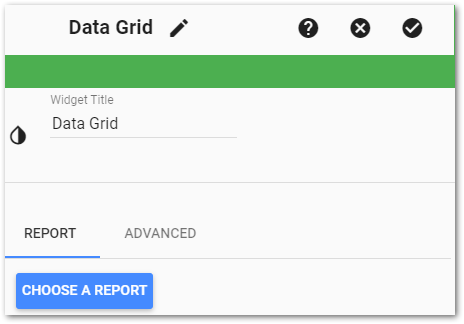
Widget Title – By default, the widget title is Data Grid. The title can be modified.
Widget Color – The color of the widget can be changed using the Widget Theme icon to the left of the widget title.
Widget Object Editor – To set various appearance properties of the widget, select the Object Editor  icon in the widget header to open the Widget Object Editor. See the Widget Editor article for more details.
Help – The Help  icon connects to the online documentation related to the specific widget.
Copy Settings – Select the Copy Settings  icon to to copy the settings from another widget of the same type. See the Copy Widget Settings article for more information.
Cancel – Select the Close without Saving  icon to exit the Widget Editor without saving changes.
Save – Changes will be applied to the widget by clicking on the Save  icon. The Widget Editor screen will close after the save operation is complete.
Report Tab
Report Chooser – This control is used to select the report or EIA to be used with this instance of the Data Grid widget. The name of the currently selected report (if applicable) is displayed by default. To select a different report or EIA, click the Choose a Report button or name of the report. The Report Chooser will open and display available reports. Select the desired report or EIA.
Note: Because the report output is displayed as rows of data in a grid, you must choose a report that produces a table of data (i.e., an IGridReport). |
Report Parameters – The report parameters (e.g., facility, sample date range, etc.) can be edited by clicking on the Edit  button to open the Report Parameter Editor for the selected report. A user with editor permission on the selected report may update the report.
After choosing a valid grid report, the widget will run the report and display the output columns for the report in a grid table. Use the table columns to configure the grid displayed by the widget.
Filter Mode – The "Multiple Selection" option enables users to select multiple rows in the data grid, which allows filtering on multiple values simultaneously. By default, this option is disabled. Move the slider to the right to enable this option.
The fields will display in the Data Grid widget as columns in the order they are listed within the Widget Editor. To change the order of the columns as they are displayed in the data grid, drag and drop the column rows (i.e., fields) to the desired display order.
Show/Hide Fields – The check box determines whether or not the field will be included in the data grid as a column. The person viewing the data grid can show/hide columns within the grid itself, but they will only be able to see the fields that are selected in the Widget Editor. If a field is not checked in the editor, the person viewing the data grid will not be able to see that field. Click the header check box to automatically show/hide all columns.
Column Header – The column names are listed as input text boxes. The name of the column is displayed in the grid as is but can be changed. For example, to display the SYS_LOC_CODE column as "Location", change the column name in the text box to "Location".
Width – This number is the approximate width of the column as a percentage of the entire width of the data grid. The default column width is 10. Adjust the column width as desired.
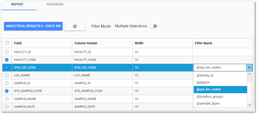
Filter Name – Click the drop-down menu in the target field row and select the desired filter name. For example, select @sys_loc_codes for a field displaying location names. Multiple fields can be set as filters. See the Dashboard Filtering section for more information about using the Data Grid widget as a dashboard filter.
Advanced Tab
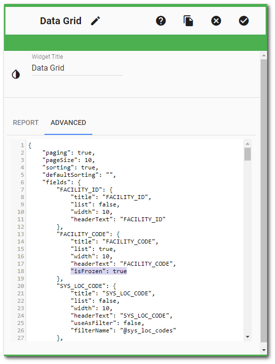
The Advanced tab displays the widget settings as raw JavaScript Object Notation (JSON). This allows for easy copying and pasting, as well as maintaining the ability to edit, add, or remove properties. See the OData in Data Grid Widget article for details on configuring OData requests using JSON on the Advanced tab of the Widget Editor. If an error is present in the JSON, the Report tab will be disabled. The JSON error needs to be resolved to enable the Report tab.
isFrozen Property – Implements the ability to "Freeze" columns in the Data Grid widget. The isFrozen property can be applied to as many columns as desired by the user. The "isFrozen": true JSON property must be added manually to the desired column's object; it is not included in the JSON by default. isFrozen will default to false for all columns. The frozen columns will always stick to the left side of the data grid, and will be ordered based upon the column ordering set on the Report tab.
isUrl Property – This property allows columns in the Data Grid widget to display their values as clickable hyperlinks. The "isUrl": true JSON property must be added manually to the desired column's object; it is not included in the JSON by default. Once set, this property treats values for the column as hyperlinks. This allows users with custom reports or columns that contain a URL be used as a clickable link from the Data Grid widget. For an external link, the URL will need to include the http:// or https:// protocol for the hyperlink to recognize it as an outside source. If the protocol is not provided, the URL will be treated as a relative link and attempt to find the location in the current solution.