Manual data entry is performed on the Grid Entry screen of the Web Forms widget. The Grid Entry screen can be opened by clicking the Edit  icon or the Create
  icon of a data form in the the Web Forms List. The Web Forms List is replaced with the Web Forms Grid Entry screen. The data entry grid reflects the structure of the Collect template used to create the data form. If the Collect template has multiple forms, then each parent form will be a separate tab in the Grid Entry screen. Each field on the form will be displayed as a column header in the grid.

The widget header displays the name of the selected data form. Hovering the mouse over the name shows a tooltip with the name, Collect template, and EQuIS format of the data form. The widget header also contains buttons to perform actions for the Grid Entry screen and the widget title, which can be changed the Web Forms Settings Manager.
Note: A data form can only be edited by one user at a time. If a data form is already being edited by another user, the data form will be locked to other users. Multiple users can add/edit content in a data form before it is submitted to Enterprise EDP, just not concurrently. |
|---|
Grid Entry Screen Buttons
Back – Returns the user to the Web Forms List.
Import and Export – Allows user to import data from a Microsoft Excel spreadsheet or export to an Excel spreadsheet. To import properly, the spreadsheet must be in the correct layout. The Export button can be used to generate the correct layout. Clicking the Export button will provide the user with an option to export the data form with data or to a blank spreadsheet. The exported file contains a separate worksheet for each form (tab) in the data form. Each worksheet contains the columns (aka fields) on that form.
When entering data in an Excel file for import into the widget, each row will need to have an ID and parent. The ID must be unique across the entire worksheet. The parent refers to the parent row ID in the parent form. If the row does not need a parent, use ‘-1’.
Save – Saves data entered to the data form but does not upload the data to EQuIS Schema tables. All data entered in the data form remains available to be edited. The Web Forms widget is automatically configured to autosave grid entry every 5 minutes (unless changed in the Web Forms Settings Manager. A data form will also automatically be saved when the user navigates from the Grid Data Entry screen or uses the browser forward/back buttons.
Submit – Uploads the data form to be checked by Enterprise EDP using the EQuIS format defined in the Collect template upon which the data form is based.
Grid Entry Screen Operation
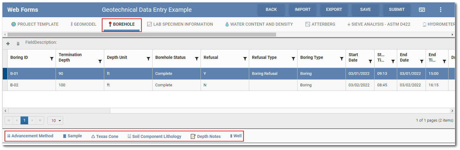
Collect templates can have parent forms and child forms (sub-forms). Thus, data forms created from the template can have parent forms and child forms. Parent forms and any forms without child forms will display as tabs at the top of the data entry grid. Selecting a tab in the Grid Entry screen will display the supported fields as column headers in the data entry grid. If child form(s) exist for the selected tab (i.e., parent form), the child forms will display beneath the data entry grid. In the example below, six child forms are associated with the "Borehole" parent form.
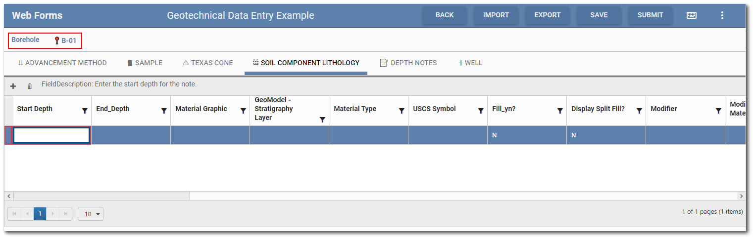
To open a child form, select a row in the parent form grid and then select a child form on the bottom of the Grid Entry screen. The Grid Entry screen will change to display each child form as a tab with the selected row from the parent form denoted above the tab(s). In the example below, borehole B-01 was selected on the parent form and the "Soil Component Lithology" tab (i.e., child form) is ready for data entry. Each child form tab can be accessed after any child form is selected.
Supported Field Types
The Web Forms widget supports many field types available in a Collect template. Unsupported field types will be disabled. The following is a list of all supported field types:
•String
•Long String
•Date Time
•Date
•Time
•Integer
•Decimal
•Selector
•Multi-Selector
•Group Selector
•Group Multi-Selector
•Dynamic Selector
•Form Lookup
•Image
•Multi-Image
•File
Data Entry in Grid
Users can select a cell in any existing record (i.e., row) in the grid to make the cell active for data entry. The field description for the active cell displays in the grid pane above the column headers. Hovering the mouse over any column header will display a tooltip with the field description.
To add a new row to the data entry grid, click the Add  icon in the upper left corner of the grid. Click the Delete
  icon to delete the selected record (i.e., row) from the data form.
The Web Forms widget was designed to support keyboard data entry. Use the "Tab" key to move between cells for quick data entry. Hit the "Enter" key to save the record and start a new record. See the Keyboard Shortcut Menu section of this article for more helpful keyboard shortcuts.
Note: If the visibility or calculated value of a field is dependent upon the value of another field, the user must actively save the record to activate the calculation/code of the dependent field. |
|---|
Reference values and other lookup information can be populated using selector field options. For fields that have selector options, values can be obtained using either a drop-down list or a dialog. By default, the multi-selector fields will use the dialog while the single selector fields will use the drop-down. The default display mechanism can be changed in the Web Forms Settings Manager. The only exception to this is when a dynamic selector field allows for user values—the field will always use the dialog.
Selector Dialog
The selector dialog has a search that can expand into an advanced search to find items more easily in long lists.
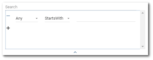
Advanced Search – Click the down arrow to expand the advanced search dialog window. Items that can be searched will appear in the first drop-down. By default, the first drop-down will be selected as Any. The Any option will search all the items to match the expression with any of the properties. The second drop-down allows the user to select an operator (e.g., Starts With, Ends With, Equals, Contains). By default, the operator is set to StartsWith. The operator defines how the expression is matched to the items being searched. Enter the expression to be searched in the text field. Multiple expressions can be set by clicking the + button below the first expression. Expressions can also be removed/cleared by clicking the – button to the left of each expression. To collapse the advanced search dialog, click the up arrow at the bottom of the advanced search dialog. Note that collapsing the advanced search will not clear search expressions that have been setup.
When the field is a dynamic selector field and allows user values, the dialog will have code and description input fields for adding a custom option. The order and visibility of these input fields depends on the display format of the field.
Note: Each custom option for a dynamic selector field must have a unique code value. If an option with the same code value already exists, the custom option will not be used. |
|---|
File Dialog
Image, multi-image, and file fields use the file dialog. To open the file dialog, click the button in the cell. At the bottom of the dialog is a button for adding files. If the field type is file or multi-image, users will be able to add multiple files. After adding a file or image, it will be represented by a section in the dialog that contains a thumbnail for the file, the file name, and two buttons—one for deleting the file and one for downloading the file.
Note: Only file types listed in the RT_FILE_TYPE table can be added in the file dialog. |
|---|
Keyboard Shortcut Menu
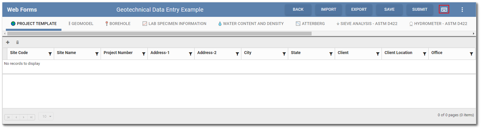
Clicking the Keyboard icon on the widget header will open a menu with keyboard shortcuts.
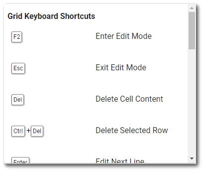
The Grid Keyboard shortcuts are also listed below.
F2 – Enter edit mode
Esc – Exit edit mode
Delete – Delete cell content
Ctrl + Delete – Deleter selected row
Enter – Edit next row
Tab – Edit next cell
Shift + Tab – Edit previous cell
Ctrl + S – Save
Ctrl + C – Copy cell content
Ctrl + V – Paste cell content
Ctrl + Alt + C – Copy selected row
Ctrl + Alt + V – Paste copied row
The Drop-down Keyboard shortcuts are also listed below.
F2 – Open drop-down
Arrow Down – Move cursor down
Arrow Up – Move cursor up
Shift + Arrow Down – Select while moving cursor
Shift + Arrow Up – Select while moving cursor
Space – Multi-select: Select item at cursor
Delete – Clear all selections
Grouping of Data Forms for Grid Entry
Collect templates can be complex with many parent and child forms. To assist with data entry, forms within a Collect template can be grouped together when a data form is created and edited in the Web Forms widget. For example, all the forms for laboratory data might be in one group while all the forms associated with field data might be in another group.
In the example below, the Atterberg and Compaction forms have been added to a Group called "Lab Data". When the Lab Data group is selected, only those two forms are available for data entry.
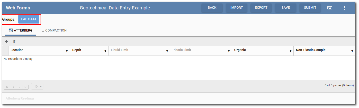
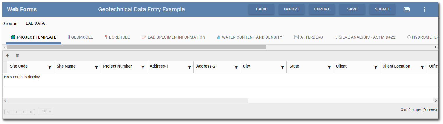
When the Lab Data group is unselected, all the forms in the Collect template upon which the data form was based are displayed again in the Grid Entry Screen.
Configuration
To create groups of forms for data entry in the Web Forms widget, EQuIS system and reference table entries are used. Add the following records to the ST_GROUP_TYPE, RT_GROUP, and RT_GROUP_MEMBER tables as desired.
ST_GROUP_TYPE
GROUP_TYPE: collect_webdataentry_group
GROUP_TYPE_DESC: Collect Web Data Entry Group
RT_GROUP
GROUP_CODE: [Group code of user's choice] – The groups will be ordered alphabetically in the widget by this field.
Note: If making changes to the order of groups, users will need to do a hard reload in the browser to see the changes.
GROUP_TYPE: collect_webdataentry_group
GROUP_DESC: [Group description of user's choice] – This is the value displayed in the widget.
GROUP_OWNER: [ID of the Collect template] – This is found in ST_COLLECT_FORMS.COLLECT_FORMS_ID.
RT_GROUP_MEMBER
GROUP_CODE: [Group code of user's choice] – Must match the group code in the RT_GROUP table.
MEMBER_CODE: [Template form name]
DISPLAY_ORDER: [Order the forms will appear in the group (i.e., 1, 2, 3)] – If less than 0, the form will not show when the group is selected.